
The Sober Bartender
A bar for every guest, built as a brand from day one.
My own company, so there was nobody to hand it to and nobody to blame. Positioning through to a living brand hub, run in public.
- Custom typeface, drawn for this brand alone
- 1
- Colors, each with a usage weight
- 8
- Logo colorways, favicon to signage
- 3
- PDFs. The guidelines are a live site
- 0
Custom typeface, drawn for this brand alone
Colors, each with a usage weight
Logo colorways, favicon to signage
PDFs. The guidelines are a live site
Client
The Sober Bartender
- Sector
- HospitalityEvents
- Website
- soberbartender901.com
- Region
- Memphis & the Mid-South
- Duration
- Ongoing
- Role
- Founder. Every operation.
- Year
- 2025
The Sober Bartender is our own venture: a Memphis mobile event bar pouring cocktails, mocktails, and dirty sodas for weddings and private events, with a non-alcoholic program that leads. It is the Cosmic Reach method with our own name on it. Positioning first, then identity, voice, menu, website, and a living brand hub, shipped as one system and run in public.
One thought runs the whole brand.
The north star is a service standard: every glass is poured like it matters. One thought connects the menu, the writing, the visuals, and the guest experience. Whatever is in someone's hand should feel considered, complete, and worth holding.
The foundations are deliberately plain. What we are: a Memphis mobile event bar, not a sober-only brand and not a juice bar. What we serve: cocktails, mocktails, and dirty sodas, each built with equal care. Who it is for: hosts and planners who want the whole room covered without making inclusion feel clinical. Why it wins: the non-alcoholic program leads, and every signature is born zero-proof and finished to order.
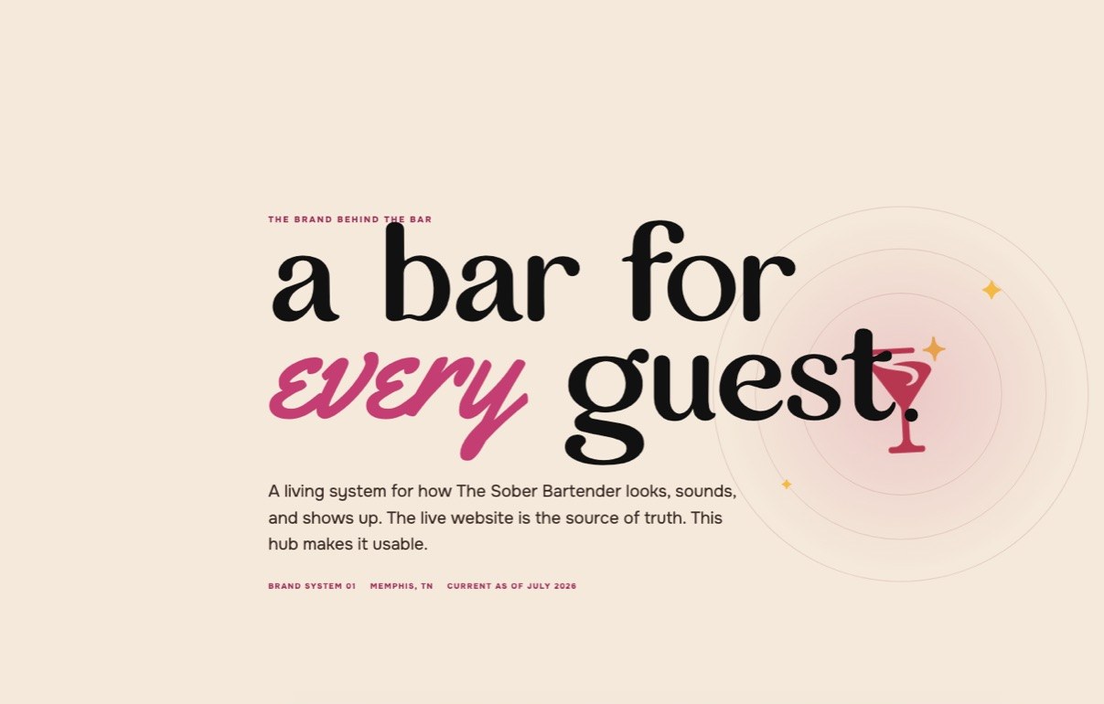
One mark, one family.
A berry martini glass, a citrus sparkle, and a hand-lettered wordmark. The mark ships in three colorways: full color on cream, cream reversed for ink and dark photography, and an icon mark for favicons and tight spaces. The rules fit on a coaster: 120px minimum, clear space of one icon height, one-color runs in ink, cream, or berry, and gold never sits on cream.
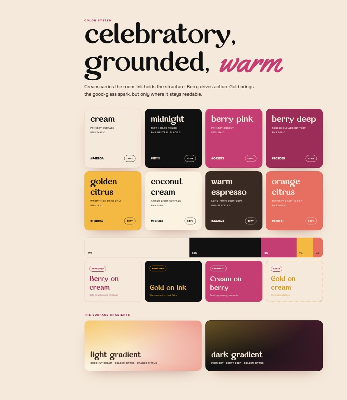
Eight colors, weighted like a room.
Cream carries the room at 44 percent. Midnight holds the structure, berry drives every call to action, and golden citrus brings the spark on dark surfaces only. Coconut cream lifts raised panels, warm espresso carries long-form copy, and orange citrus is the tertiary pop. Every pairing is pre-approved, and the one banned move is written down: gold on cream collapses contrast.
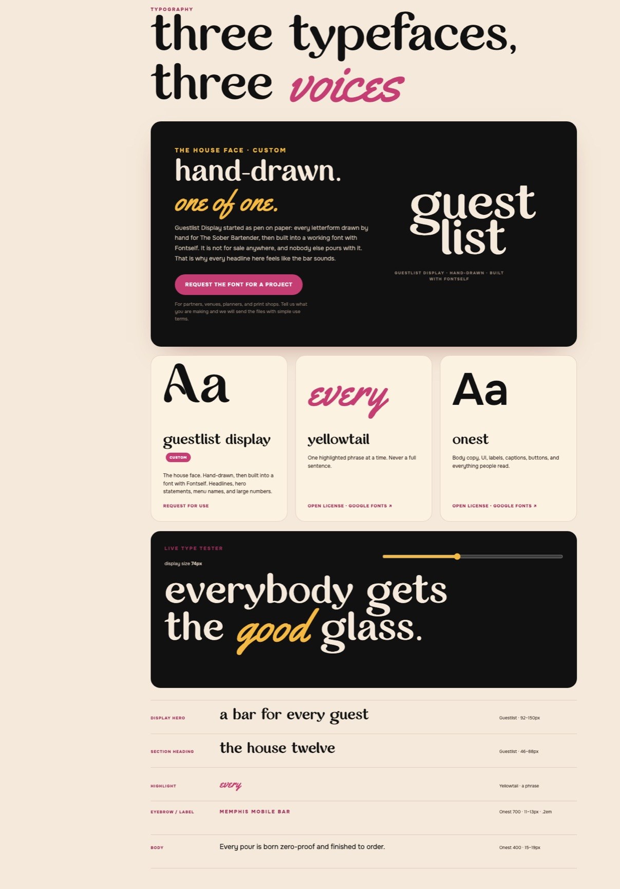
Three typefaces, three voices.
Guestlist Display is the house face: every letterform drawn by hand for this brand, then built into a working font with Fontself. It is not for sale anywhere, and nobody else pours with it. Yellowtail highlights one word at a time, never a full sentence. Onest does the reading work: body copy, UI, labels, and buttons.
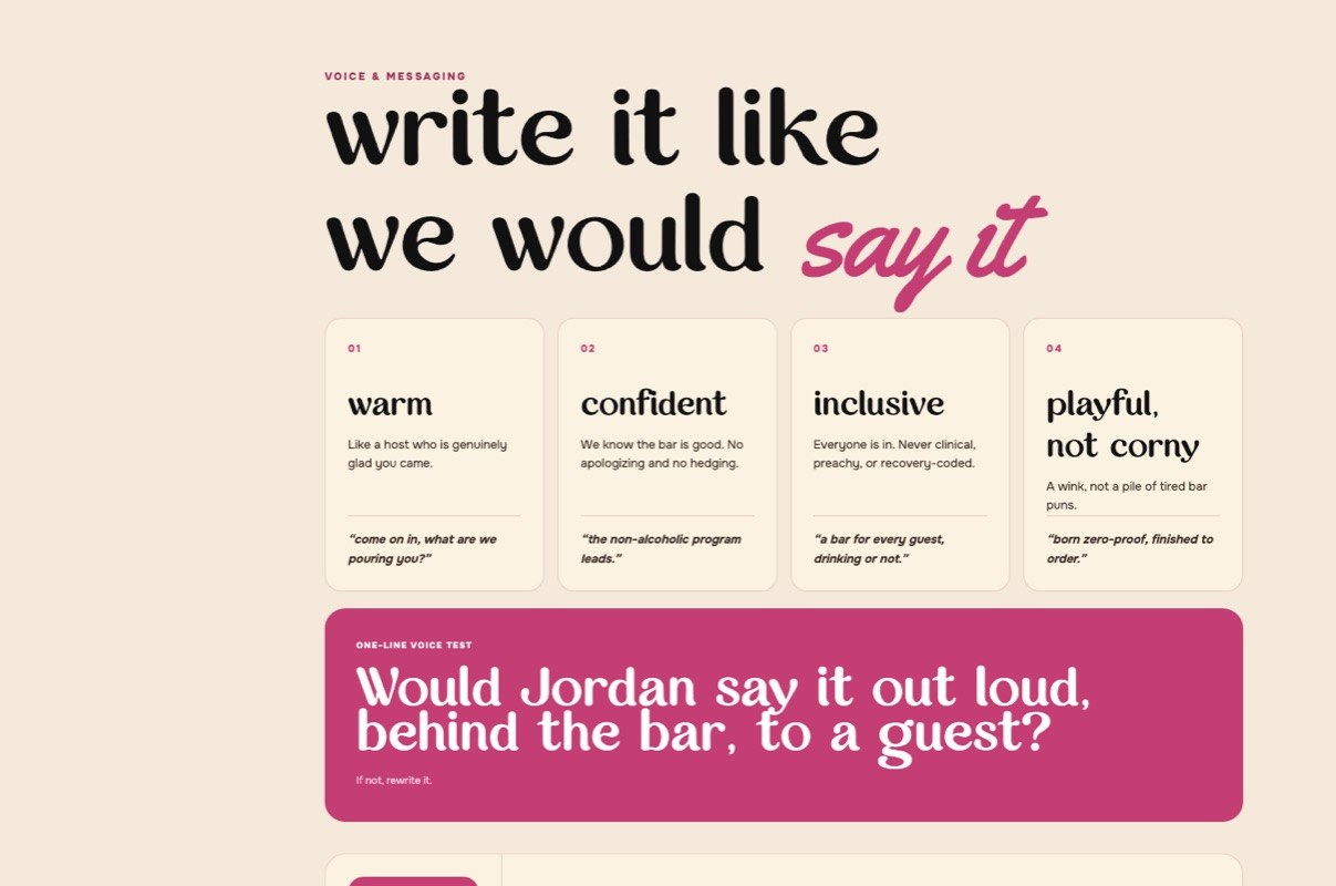
A voice you can test in one line.
The voice is warm, confident, inclusive, and playful without getting corny. Every line has to pass one test: would Jordan say it out loud, behind the bar, to a guest? If not, it gets rewritten.
Say this: every guest gets the good glass. Born zero-proof, finished to order. Not this: we also do mocktails. The system bans anything that makes alcohol the villain, because the bar is the point, not the absence.
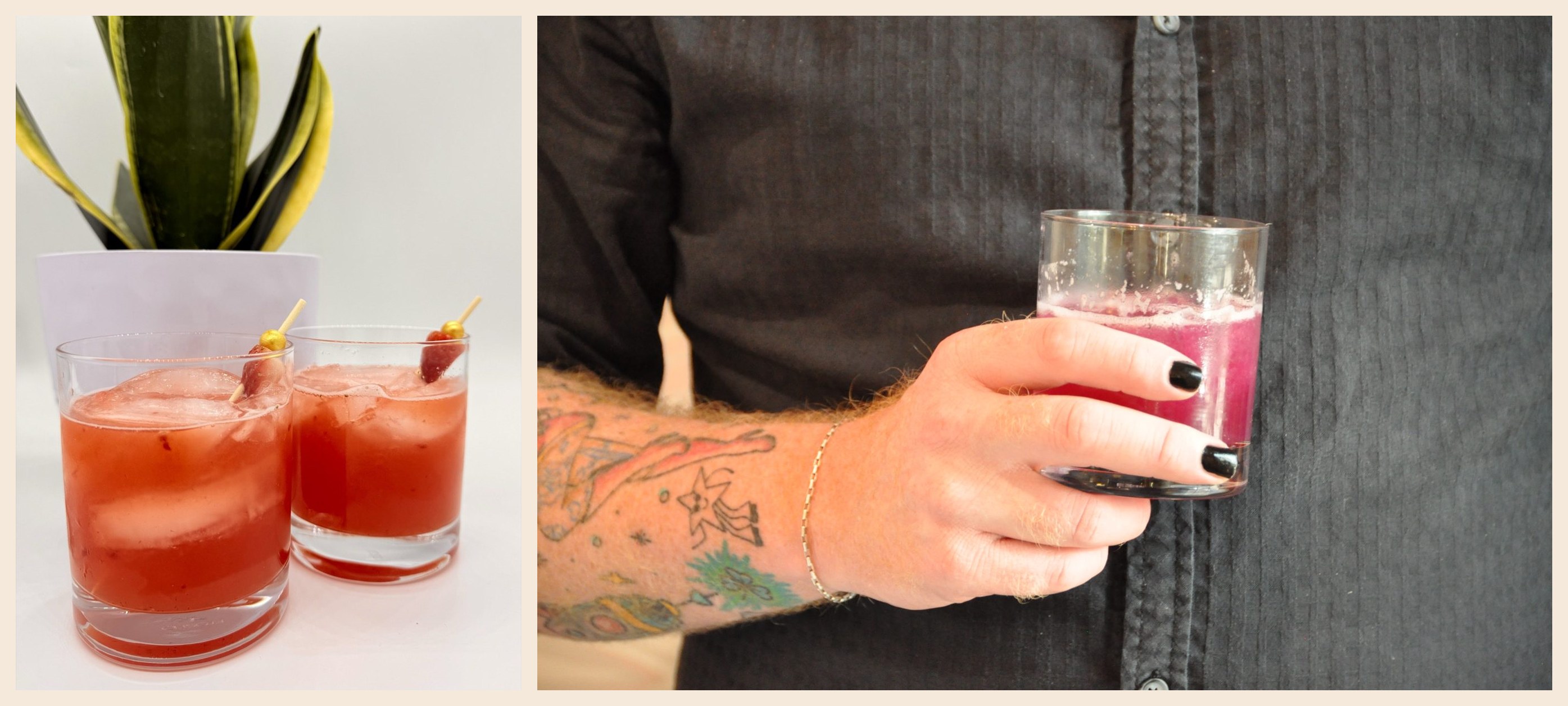
Photography: real, warm, in the moment.
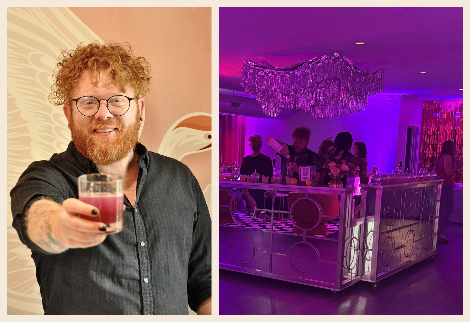
Natural light, real hands, real drinks, candid energy. Berry, citrus, and gold get to pop while skin tones stay honest. Connection beats staged perfection.
Shipped as a living system, not a PDF.
The guidelines live at soberbartender901.com/brand, in sync with the site: logo downloads, a live type tester, the one-line voice test, approved color pairings, and a motion recipe measured to the pixel. The bar, the website, and the brand hub all run on the same system.
Why it is in the portfolio.
This is the framework we sell, run with our own money on the line. Every claim on this site about positioning before design, offers before pages, and systems before assets is being tested in public, one event at a time. The credit line at the bottom of the brand hub is ours.
Color System
Cream
#F4E9DA
Midnight
#111111
Berry Pink
#C43E73
Berry Deep
#9C2D59
Golden Citrus
#F4B942
Coconut Cream
#FBF2E1
Warm Espresso
#3A2A24
Orange Citrus
#E76F61
Every choice cost something.
A decision with no downside was never a decision. These are the calls that shaped the work, and what each one gave up.
- 01
Rebuild it rather than restyle it
A first version of this brand already existed and ran for a year on Squarespace. It worked. When the shape of the business changed, the cheap move was to restyle what was there. I started again from positioning instead, because the thing I actually wanted to fix was underneath the design.
The tradeI threw away a year of a working brand and paid for the whole system twice. What I got was the brand I actually wanted rather than the one I had talked myself into.
- 02
Take the name back to the singular
The brand had been running in the plural. Refining it back to The Sober Bartender was the decision that let everything else lock into place, because a singular name is a person behind a bar and a plural one is a company. The whole voice depends on which of those you are.
The tradeIt meant retiring recognition that had already been built. A name people half remember is worth less than one that says what the brand is.
- 03
Own every operation, not just the look
Marketing, ops, pricing, hiring, systems. All of it is mine, which is the difference between designing a brand and having to live inside one. Cosmic Reach did the signage, the menus, and the launch, and then I had to go work a bar under all of it.
The tradeThere is nobody to hand the hard parts to and no client to blame when something does not work. It is also the only way to find out whether the advice I sell survives contact with a real business.
- 04
Treat the brand as the operating standard
The line that runs the whole thing is a service standard rather than a look. Every glass poured like it matters. That decides the menu, the writing, the visuals, and how a guest gets spoken to, which means the brand is not a layer on the business, it is how the business behaves.
The tradeI knew this before I started and still nearly missed it on my own company, where it is far easier to treat the brand as decoration. It is a standard you have to keep to on a Saturday night, not a document.
What we shipped.
- Brand strategy, positioning, and north star
- Logo system: primary, cream reversed, and icon mark
- Eight-color system with usage weights and approved pairings
- Guestlist Display, the custom hand-drawn house typeface
- Voice and messaging system with say-this, not-this rules
- Photography direction
- Website design and build
- Living brand hub at soberbartender901.com/brand
If your work is ahead of your website, the gap is costing you.
The Brand + Website Review names the gap. The Brand + Website System closes it.