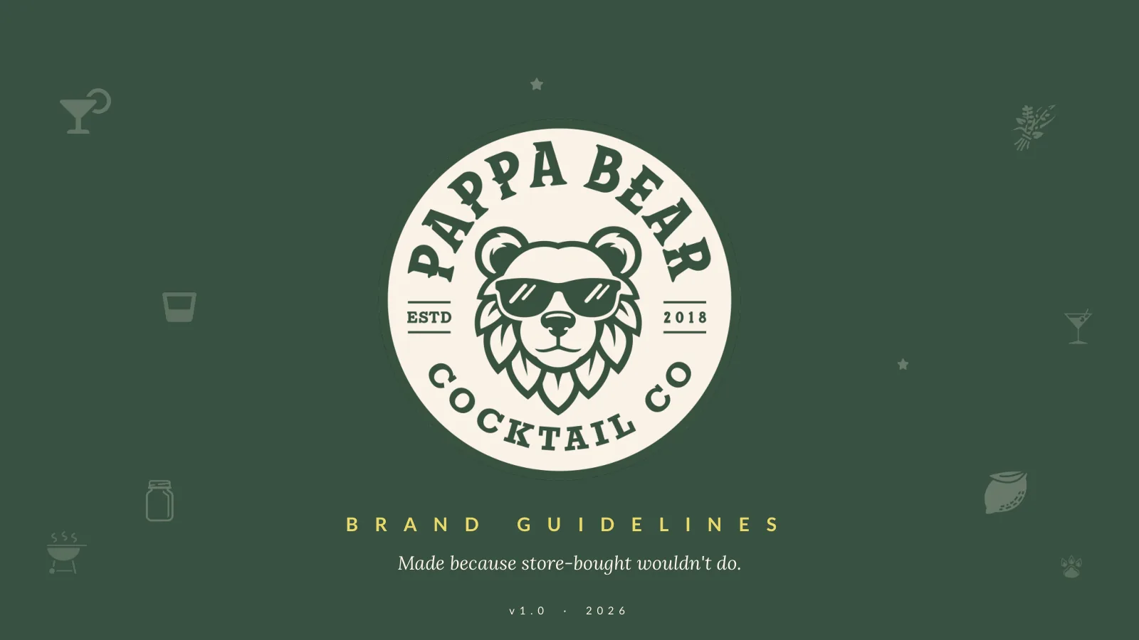
Pappa Bear Cocktail Co.
Taking a mason-jar batch from the back porch to the shelf.
Client
Pappa Bear Cocktail Co.
- Capabilities
- Brand StrategyMessaging & VoiceVisual Identity
- Sector
- Craft Beverage
- Duration
- Brand System
- Role
- Brand guidelines system
- Year
- 2026
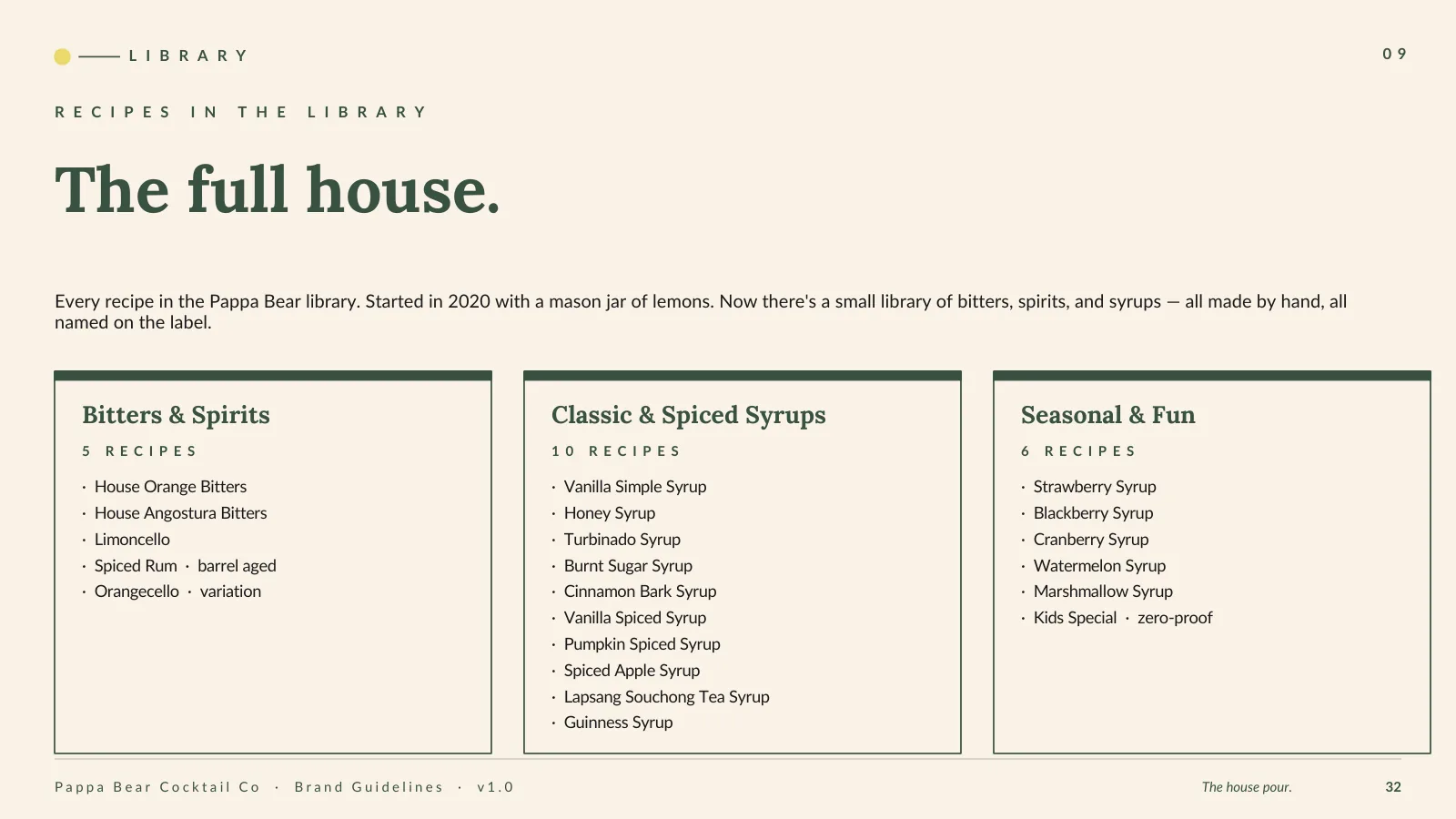
Pappa Bear Cocktail Co. is a small library of bitters, spirits, and syrups, made by hand because nothing on the shelf was quite right. It started with a mason jar, a few lemons, and a hunch that store-bought could be beaten. We built the brand system that lets a back-porch reputation travel without losing the warmth that made it: a voice, a locked mark, and a full identity built to sit on a shelf next to brands ten times its size.
The house pour.
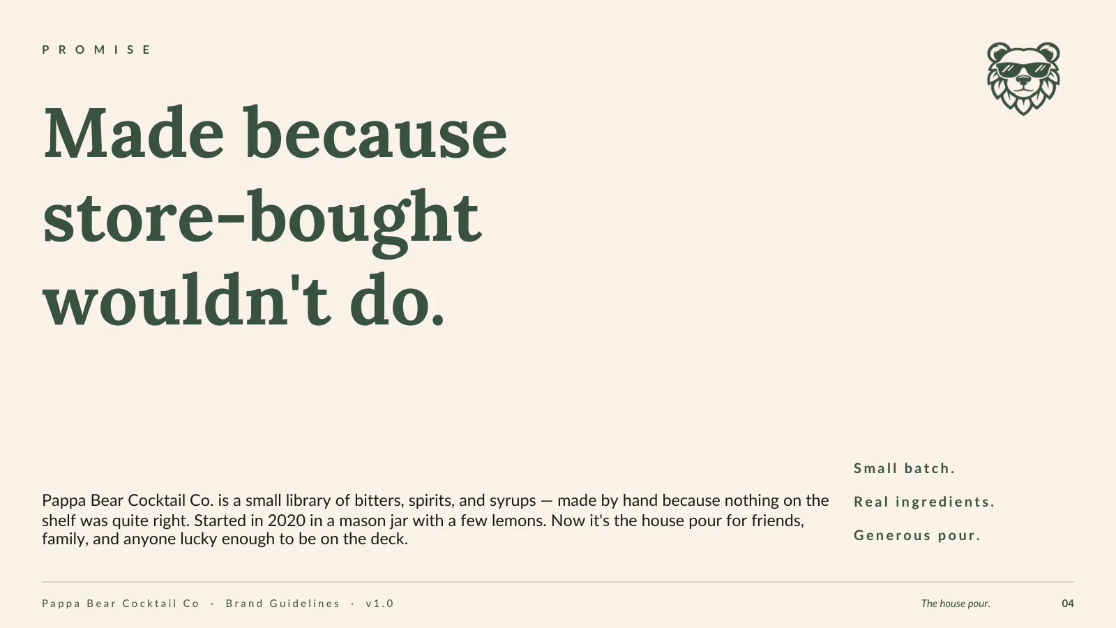
Pappa Bear started in a mason jar with a few lemons and a hunch that the limoncello on the shelf could be better. A month of patience, a little sugar, and the first bottle was poured for the family. Syrups came next, then bitters. The story has not changed: still made by hand because store-bought would not do. The brand had to bottle that without turning it into craft theatre.
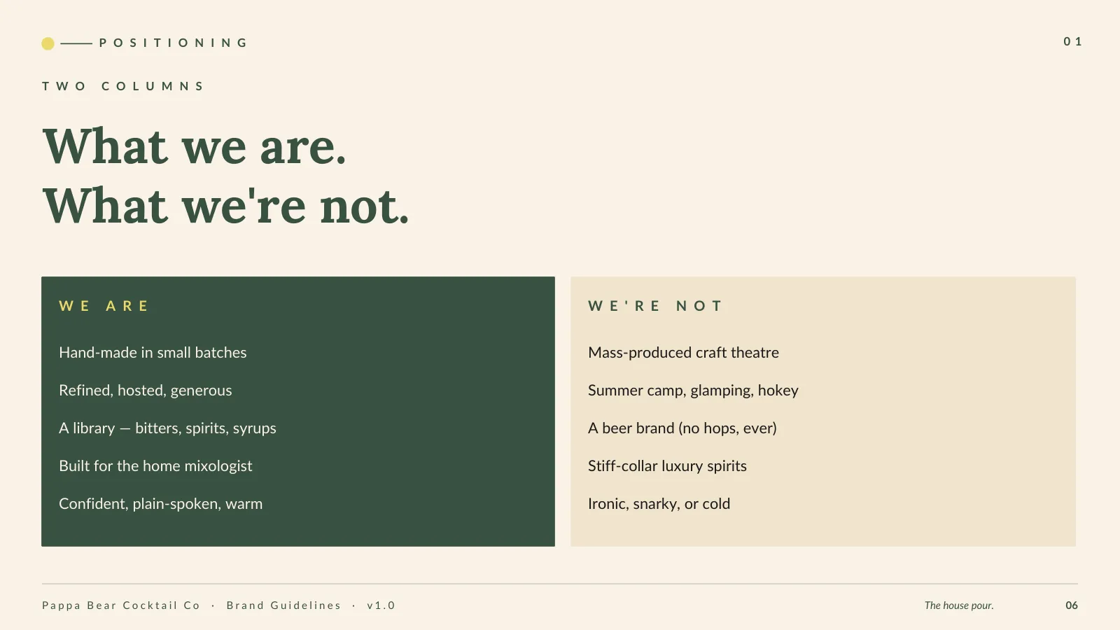
Refined, hosted, generous. Never hokey.
The voice is the host: confident, plain-spoken, warm. It is hand-made and small-batch, built for the home mixologist. It is not mass-produced craft theatre, not summer camp or glamping, not a beer brand, and never stiff-collar luxury. A tight list of words it uses and words it avoids keeps every label, gift note, and recipe card sounding like one person poured it.
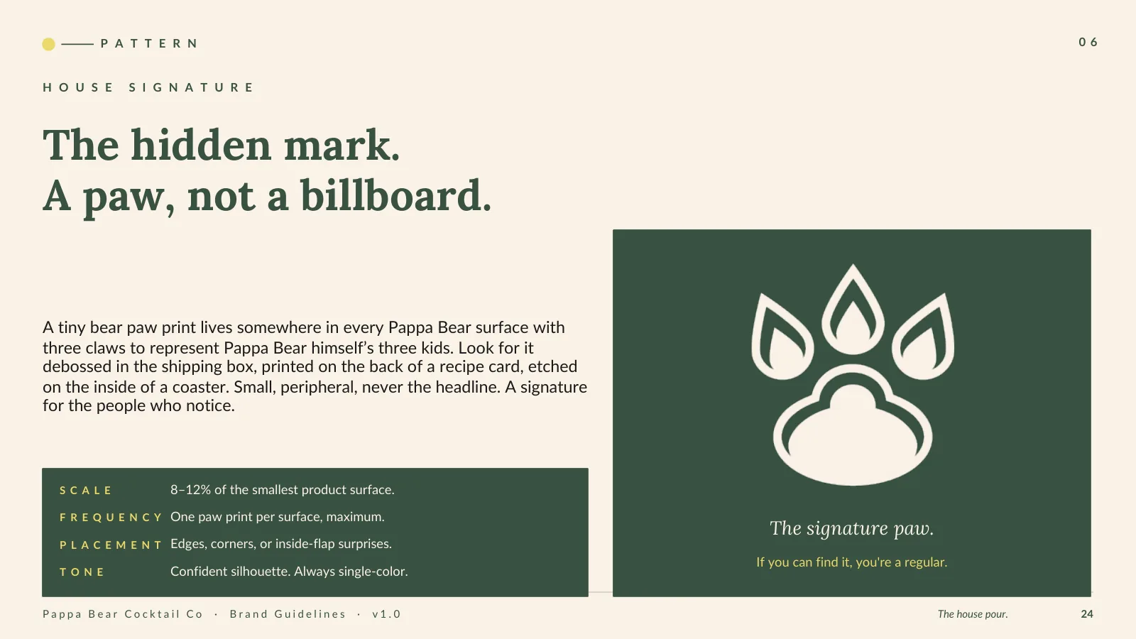
A locked mark, and a signature for regulars.
The bear, the sunglasses, and the PAPPA BEAR letterforms are drawn once and never change. Underneath the system is a quieter move: a tiny three-claw paw print hidden on every surface, one per piece, debossed in a shipping box or printed on the back of a recipe card. The three claws stand for Pappa Bear's three kids. It is a signature for the people who notice. If you can find it, you are a regular.
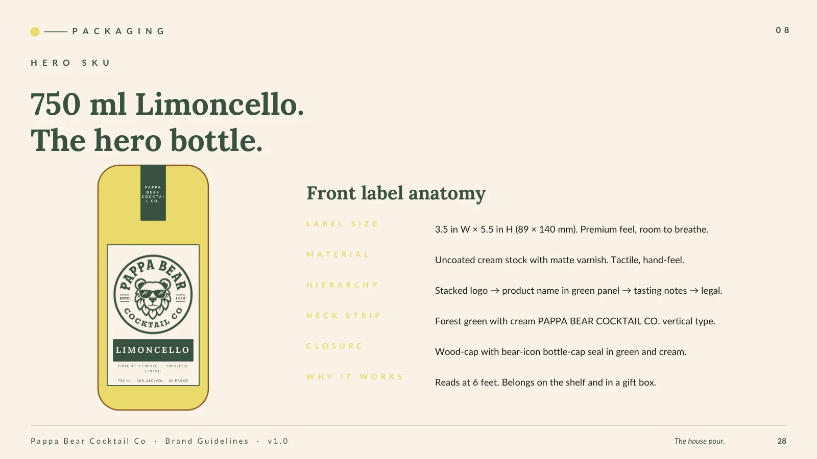
Forest, cream, and a spark of Limoncello.
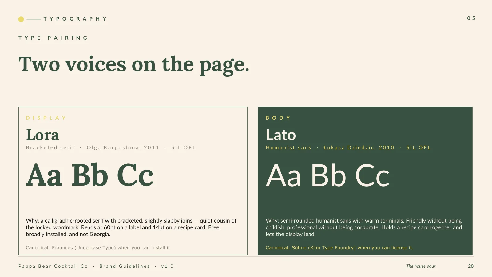
Color runs on a 60-30-10 rule: sixty percent Forest Green or Warm Cream, thirty percent the other, ten percent accent. Limoncello is the spark, a bottle cap or a callout, never the canvas. Amber and Cabin belong to product, on syrup labels and gift packaging. Type pairs Lora and Lato day to day, with Fraunces and Söhne as the canonical upgrades, so a label reads at sixty point and a recipe card holds together at fourteen.
Built to gift, built to grow.
The system runs from the hero bottle out: a 750 ml Limoncello, a family of cocktail syrups, the bitters, and a gift box that pairs them with a recipe card. Ten chapters of guidelines, from origin and voice to packaging and handoff, keep it consistent as the library grows.
Color System
Forest Green
#395141
Warm Cream
#FAF2E7
Limoncello
#EBD96B
Amber Syrup
#6B3F1F
Cabin Brown
#8B5A2B
What we shipped.
- Brand strategy and origin narrative
- Brand voice and messaging (the host)
- Logo and wordmark system (locked bear mark)
- Hidden three-claw paw signature
- Color system with the 60-30-10 rule
- Typography system (Lora and Lato, Fraunces and Söhne)
- Packaging and label direction
- Product line and gift-box architecture
- Ten-chapter brand guidelines book
If your work is ahead of your website, the gap is costing you.
The Brand + Website Review names the gap. The Brand + Website System closes it.